Sending is arithmetic, not a dashboard.
Twelve destinations over one fixture: journeys that run continuously, broadcasts that wait on an approver, the audiences both send to, and whether any of it arrives. Looking at it should settle whether generated figures can be made to reconcile across thirty-five screens.
Preview interactive design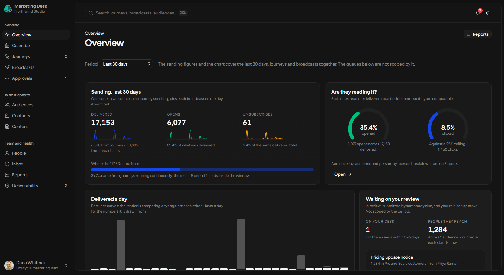
Automations run; sends wait on people.
The lifecycle lead owns journeys that send without her and broadcasts that cannot send without somebody else. Both feed one delivery number, and she is answerable for it whichever half moved.
01The screens →Two of five journeys need attention, and the screen says why in the predicate’s own words — one failing to deliver for 11.6% of everyone entering it, the other live but silent for eleven days.
entered = completed + at + failed + exited02ApproveTwo broadcasts sit in review and only one of them is hers to approve. One predicate answers for the row button, the section count, the nav badge and the team screen alike.
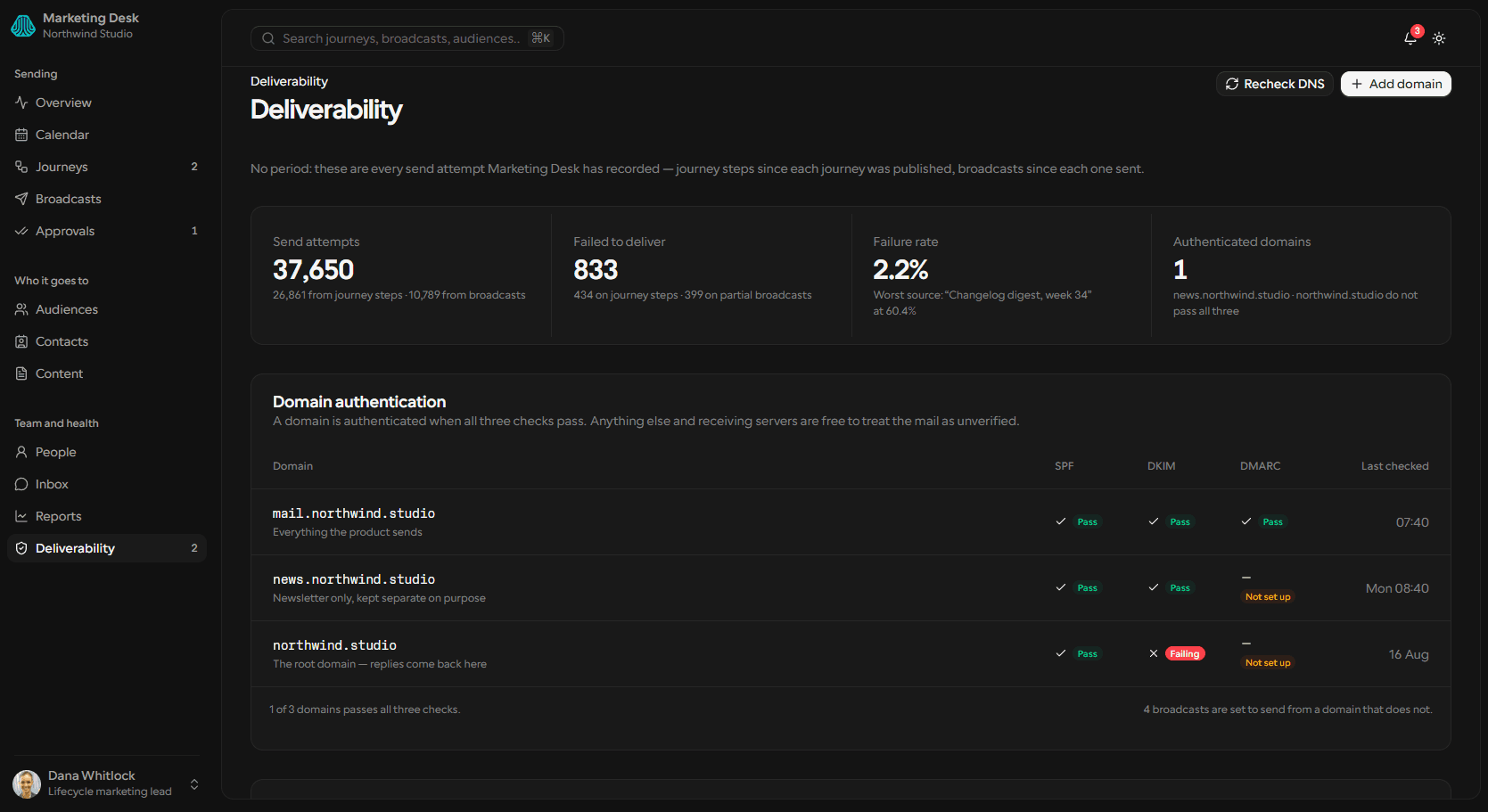
the badge reads 1, not 203Account for itDeliverability is not time-scoped and says so: 833 failures against 37,650 attempts, 2.2%. The table under it decomposes that by journey step and settled broadcast, worst first.
one threshold, compared at the displayed precisionEach screen owes the one before it an answer.
Thirty-seven registered routes: twelve destinations in the sidebar across three groups, nineteen off it, six for auth. Activity has no list screen — it is one feed reached from the inbox, the overview and every profile, and a thirteenth destination would push a nav group past what it can hold.
02The status set →Where journey sending and broadcast sending are added up
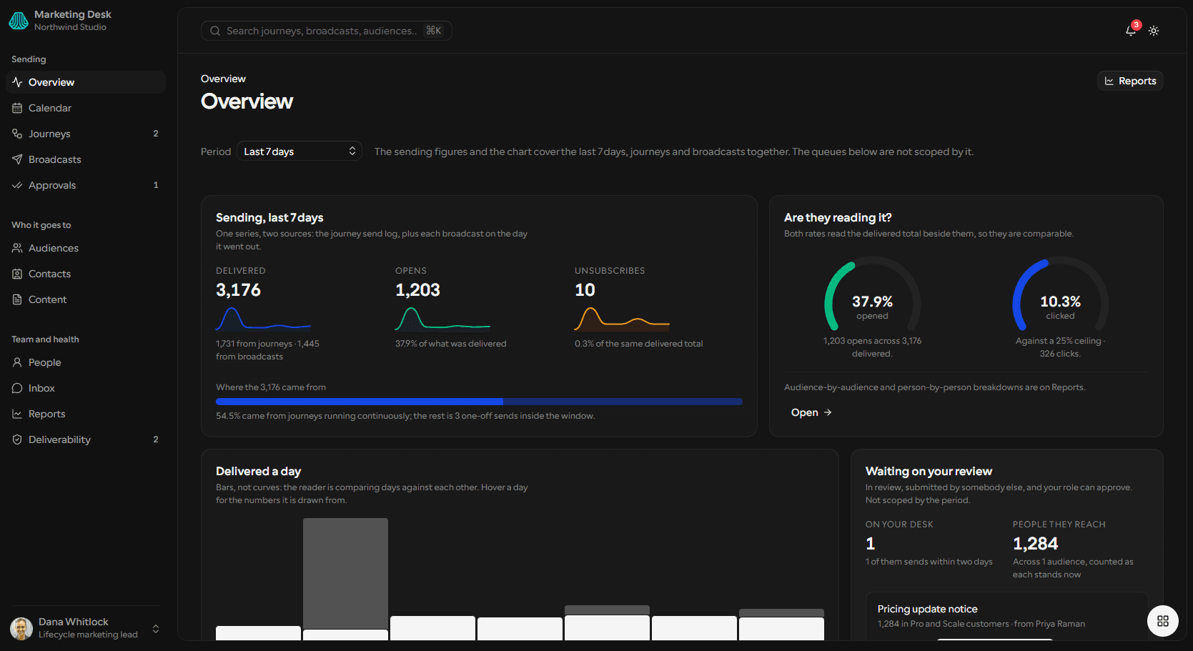
The headline claims one delivered figure for the whole workspace, so it owes the reader both halves. The day chart is that same series plotted, and the four queues below are the predicates the sidebar badges count. It averages nothing across the two sources.
- 3,176 over seven days — 1,731 journeys, 1,445 broadcasts, 54.5% of it continuous
- Straight bars, because days are being compared against each other
- The period offers 7, 14 and 30, because the log holds thirty days
A journey’s ladder, and where people are standing on it
The arithmetic closes on every step — entered on one is what continued from the one above it, and each meter’s track is that step’s own entered, so the unfilled tail is whoever is still standing there. Enrolment is the sum of those tails and nothing else.
- 962 entered the first step, 869 reached the end — 90.3% of them
- Nobody is enrolled now, because the trigger stopped matching on 14 Aug
- 22 delivery failures, 9 of them on one step, 0.8% of every attempt

Approvals, split by who is being waited on
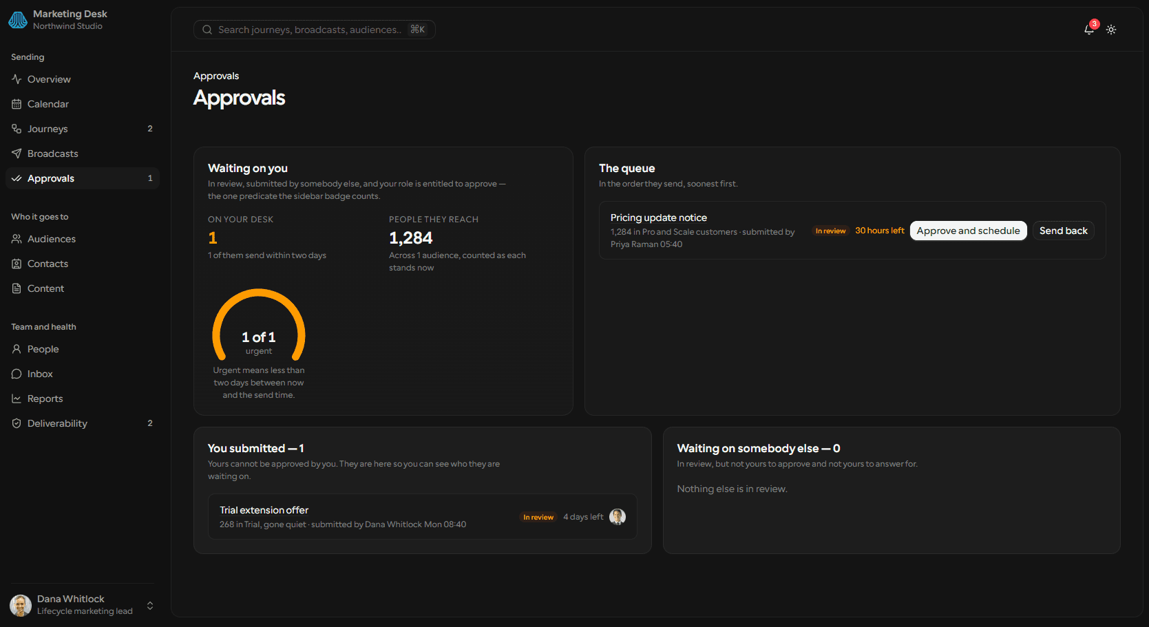
Three queues out of one predicate: waiting on you, submitted by you, waiting on somebody else. The middle queue is where the operator is the one holding things up, and nothing is disabled to avoid deciding — a send you submitted yourself carries the reason instead.
- Two broadcasts in review, one of them approvable by this viewer
- “Yours cannot be approved by you” — the other carries who it waits on
- One sends in 30 hours, to 1,284 people, and 1 of 1 counts as urgent
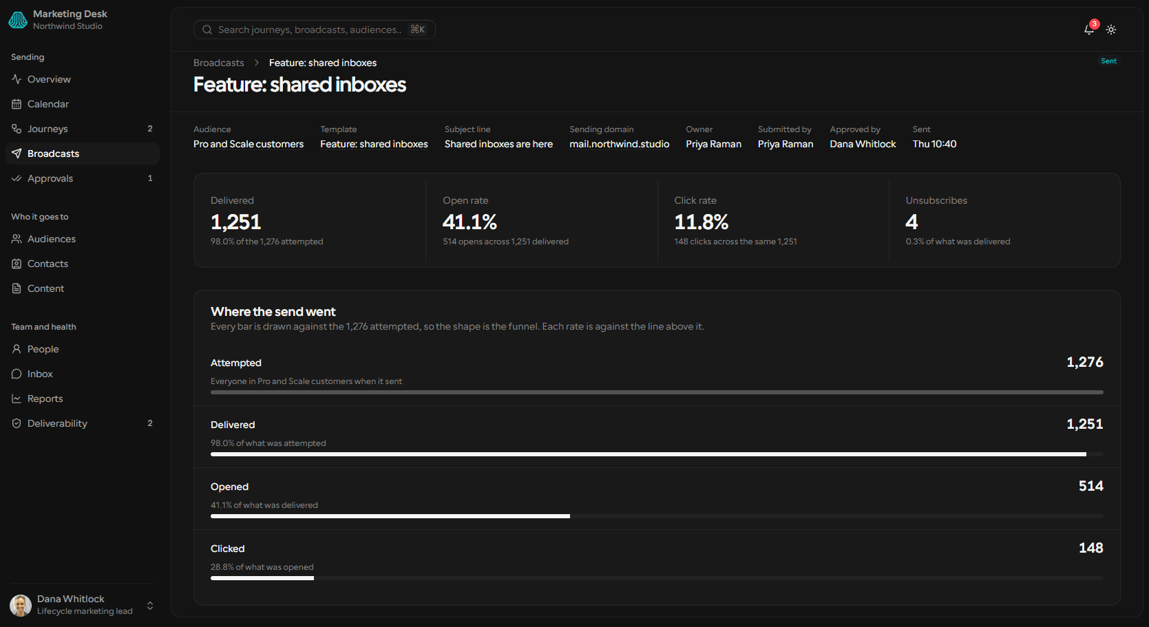
A send report drawn as the funnel it is
Attempted, delivered, opened, clicked — each bar measured against the top of the funnel, so the shape is the funnel, while each row also states its own rate against the row above it. A send still running reports what it has handed off, never a projection.
- 1,276 attempted, 1,251 delivered, 514 opened, 148 clicked
- Every bar against the 1,276; every rate against the line above it
- 11.8% clicked of delivered, and 28.8% of opened — both stated, neither mixed
Three checks, across three domains
A grid question gets a grid: SPF, DKIM and DMARC for each sending domain, and a domain counts as authenticated only when all three pass. Underneath, the failure figure decomposed by source — and the screen refuses to scope itself to a period, saying why in the lede.
- 833 against 37,650 attempts — 2.2%, over the one 2.0% threshold
- One domain of three passes all three checks; the root has failed DKIM for nine days
- The broadcast that died mid-send went out from that domain — 268 attempted, 106 delivered
Six values, and the two everybody expects are missing.
Broadcast status is where a one-off send sits between written and delivered, grouped by who it is waiting on. Overdue review and partially delivered are not in it — both are computed at render from the record and the clock, and storing either would let a value disagree with the arithmetic.
03The awkward cases →The cases a generated product gets wrong.
All three are real records in the fixture rather than hypotheticals.
04The audit →Walked against the rows, and they close.
Every derived figure was checked against the array under it and none disagreed: 26,861 journey attempts and 10,789 broadcast sends make the 37,650 the failure rate is drawn from, every journey step sums to the number that entered it, and the approval rule resolves the same way in all four places that read it.
05Back to the top →
Reckon
The shell is reusable.
The arithmetic is not.
Twelve destinations, thirty-five routes and four status fields are the easy half. What takes the time is the figure that has to agree with the rows under it on every screen that quotes it.